Week 5: Data visualisation
In this workshop there was a building upon week 4 by visualising data collected that week. Three data visualisation techniques were outlined: data analysis and visualisation in MS Excel, data visualisation in Tableau Public, and network analysis in Gephi. Prior to this, some interesting critical questions were raised which should be considered when reading data concerning accuracy, transparency and assumptions. This will be helpful throughout my MA study upon critically reflecting on my work and others.
MS Excel
I had real difficulty with MS Excel charts, which was frustrating because I knew and understood how to use them - having done so during my UG degree - yet it was as if my data was not 'working' properly. I wanted to see whether there was a correlation between the anonymity of the user and the seriousness, but Excel didn't know how to properly handle the data logically (binaries of anonymity were valued last week as 0 or 1, with seriousness valued at 1, 2 or 3).
Tableau Public
I like Tableau Public because of its effectiveness at creating comprehensive data visualisations. It installed my dataset, yet again running into difficulties when interpreting how I interpreted the data the week prior (even though my interpretation was how we were outlined to in class). To try and present something, therefore, I opted to download another dataset concerning Spotify streaming information instead. This was more successful and I produced a number of visualisations, including the below, because I was curious to see whether there was a correlation between the year of a track's release and its BPM:
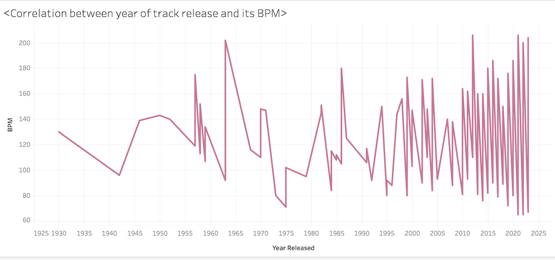
I was interested to see if there were any correlation because in the field I work in (electronic music media) there is a current debate about whether its music is getting 'harder and faster'. Therefore, having a real-world example of data concerning music more broadly taps into my interest, and turned a frustrating session into a beneficial one. I learned that I can really tap into my interests, should I want to.
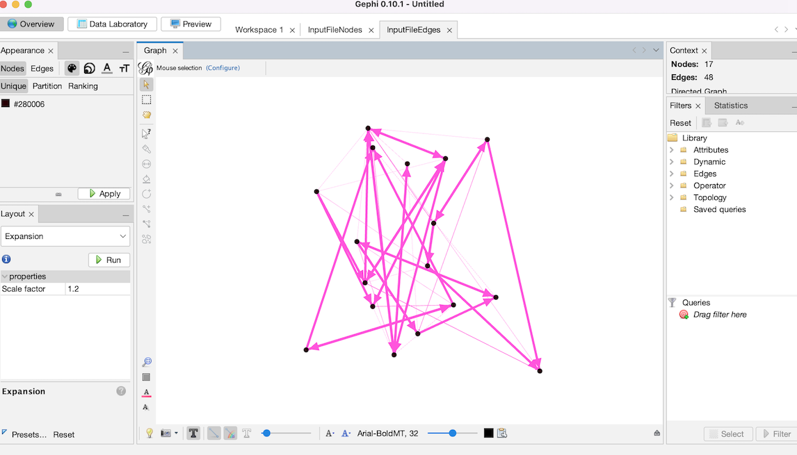
Gephi
I was entirely unfamilar with Gephi, but found it an interesting method to visualise network analysis. I got along with it will, using an example dataset looking at their media outlet and their audience size. This way, network analysis enables us to see how the connections between people, media, data and other things link, perhaps explaining the formation of communities, travelling of communication and level of influence. For effective network analysis, particular data types are needed - what/who the entities are, and how/whether they are connected. These are referred to as the 'nodes' and the 'edges'. Below, you can find an outline of what I began to create in my workspace (and next time, I'm going to work out how to add text which can identify the name of the media organisation / node!):
I plan to explore the Data Viz Catalogue for further inspiration and to learn more about data visualisation.